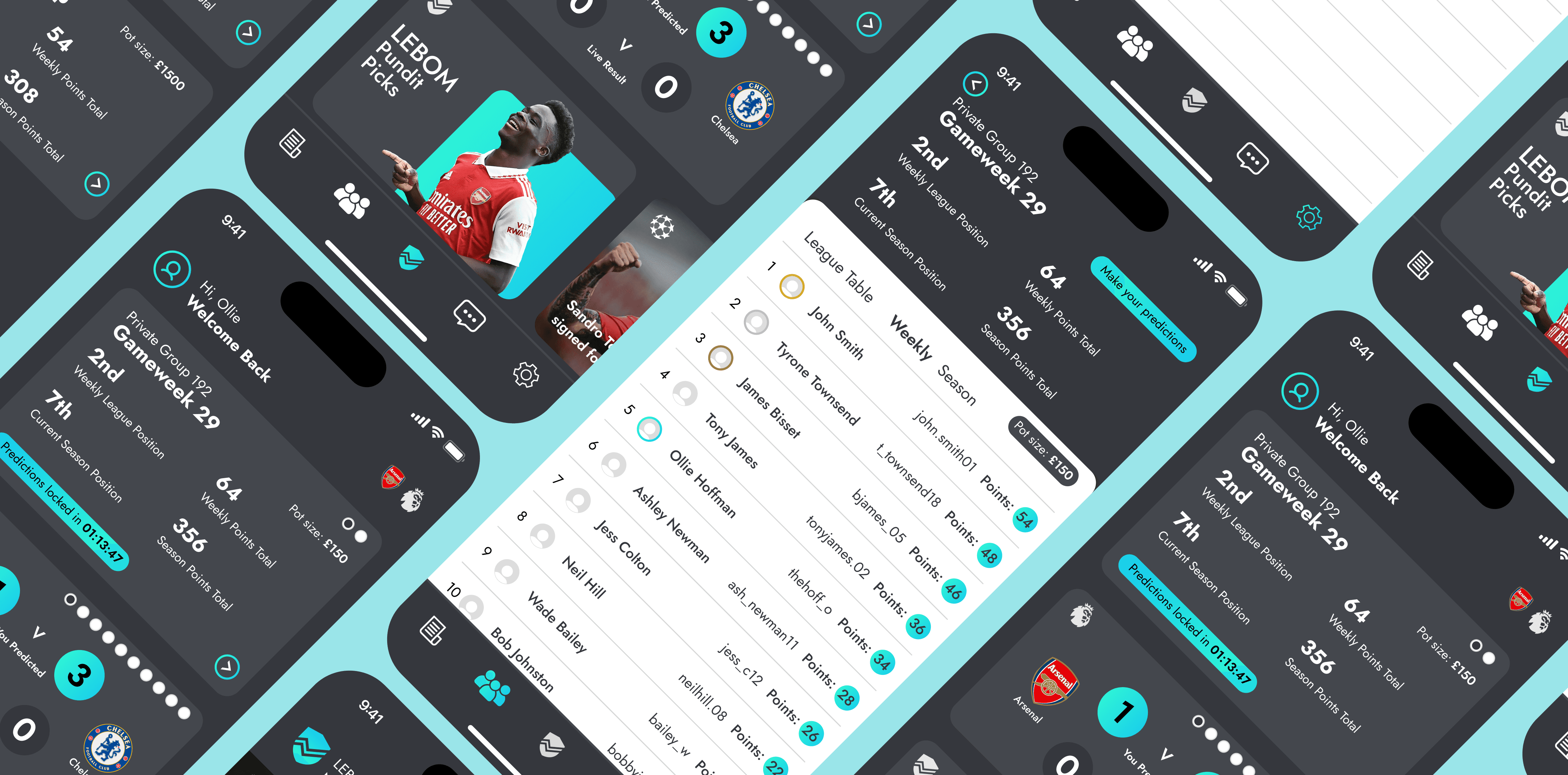
LEBOM
LEBOM is a betting application with the USP of betting against your friends rather than the bookmaker.
01
Problem Statement
Despite a major marketing push in the last 6-12 months, users aren't continuing to play Lebom.
I first identified this problem on social media (TikTok, Instagram & Reddit), and through my own experience playing it with my friends and family.
This decline in user retention is causing potential revenue loss and reducing valuable data, which in turn impacts app development.
So I wanted to discover the problems causing this and produce a revised version of the app.
Project Goal: Increase user retention and decrease churn.
02
My Process
So, how can we do this?
To address this problem holistically, every area within the users journey and experience needs to be accounted for, only then we can produce our desired result.
I've broken down my process into four specific stages:
1) Heuristic Evaluation and Personal Audit:
A heuristic evaluation and personal audit will be able to help me establish a basis of the current problems.
This will include assessing the app’s ease of use, accessibility, and overall user experience.
The goal is to form initial hypotheses about the origins of potential touch points creating issues.
2) User Research Interviews
These will involve open-ended questions to understand why users continue or stop using the app.
These will ask specific questions about pain points, feature usability, and overall satisfaction to gather unbiased feedback.
3) Observational Study
An observational study will be conducted where users interact with our app and similar betting apps.
We will focus on both automatic and deliberate actions to pinpoint where users experience friction.
This includes observing how users navigate the app and where they encounter difficulties.
4) Insight impact and Design Revisions
The insights gained will be measured against my hypothesis and then used to identify common themes and pain points.
We will then create actionable design revisions in Figma, addressing the identified issues and improving user experience.
These revisions will be iteratively tested and refined based on user feedback, utilising A/B testing.
03
Research + Implemenation
Lets see it in action:
A multi-method qualitive approach provided key user insights.
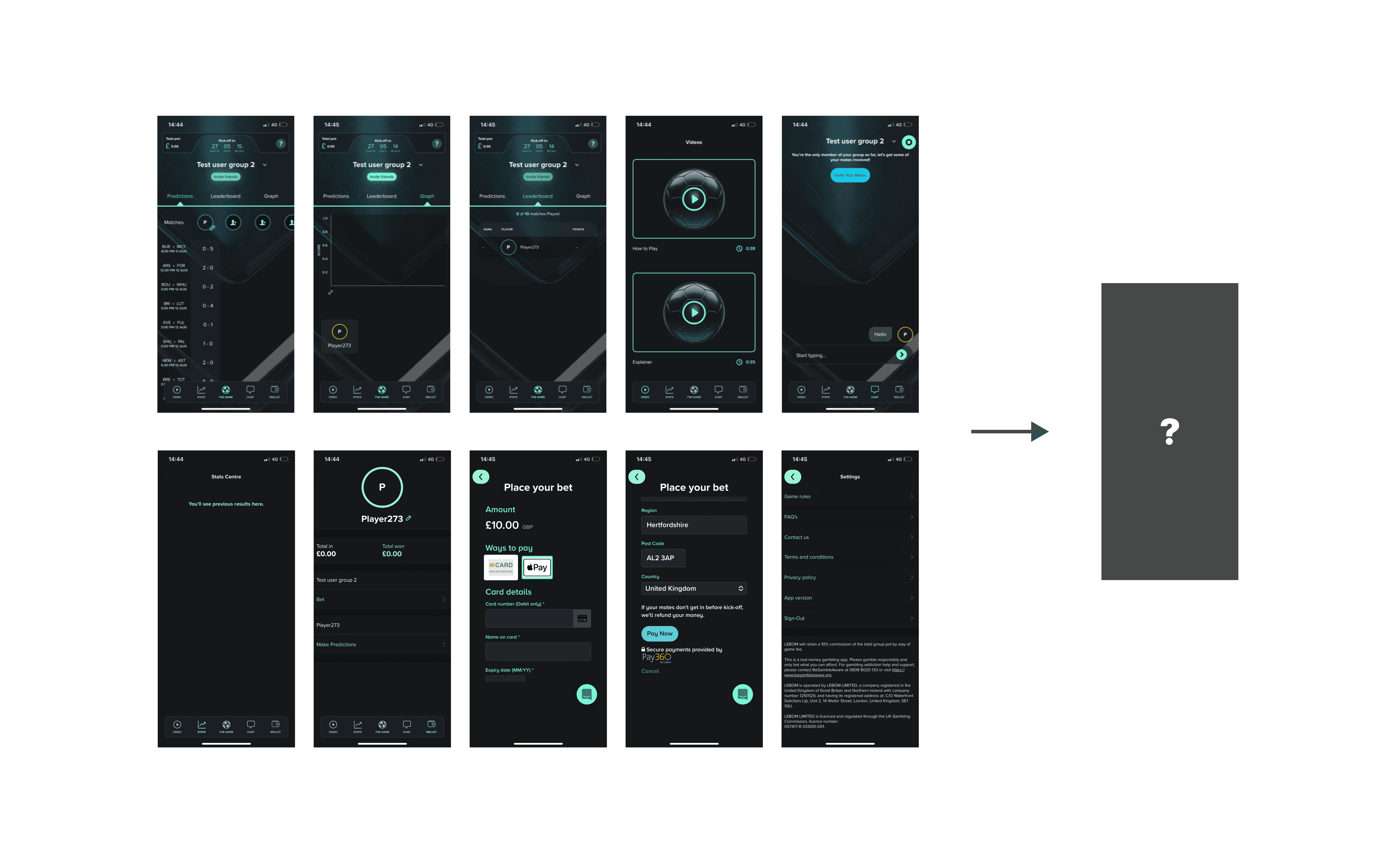
Heuristic evaluation results revealed touch points where a lack of experience design had caused pain points, forming the hypothesis.
"The build up of unnecessary friction and lack of familiarity cause users to churn at high rate"
To test this a focus group with target users and an observational study was conducted. Participants were observed interacting with the app and similar betting apps to identify specific usability issues from an unbiased perspective.
If you want to see a more detailed version of this test Click Here
Then the informal interviews were used to expand on insights found within the observational study. These interviews helped refine our understanding of user needs and pain points.
These groups were then used through the process to measure the success of revisions and in A/B tests.
The key findings were refined down to:
1) Complicated wager placement
2) Lack of a centralized homepage
3) Limited app utilization
With these insights we can now build.
In this development stage, we employed an iterative approach guided by IBM’s model and the double diamond framework. This approach facilitated a structured design process focused on continuous improvement.
We began by leveraging previously created user personas to develop a comprehensive user journey map. This map was optimized to identify and eliminate friction points experienced by new users.
Paper low-fidelity (lo-fi) screens were created and A/B tested with participants from earlier interviews to compare different design concepts. Key outcomes from these tests included:
Homepage Improvement: Enhanced accessibility to important features and information.
News and Statistic Pages: Replaced the tutorial page, encouraging regular app use through consistent notifications.
Accessibility Options: Identified the need for better accessibility features.
Based on feedback from A/B testing and additional interviews, we created high-fidelity wireframes in Figma. These wireframes incorporated user input to address issues identified in the lo-fi studies. The final designs, including UI and graphics, were developed with a focus on accessibility, particularly for colour-blind users, by carefully selecting colour palettes.
Throughout the process, we continuously incorporated feedback from user testing and stakeholder reviews to refine the design. This iterative approach ensured that the final product effectively addressed the identified issues and improved user retention.
04
Result
Altering the design of this app was mainly to provide a better experience for the user, familiarity and easing the learning curve for new users was the main goal.
We performed interviews with the original user group .
The results were all positive, users were able to easily perform the functions from the original user study especially new users.
There was positive feedback on the new balance & Wallet function were users didn't have to constantly update a wager each week and the news feed showed signs it would increase engagement.
What would make this case study better?
Being able to do a large quantitative data study with hundreds and thousands of users may have lead to additional insights. Also having a stakeholder to work with may lead to more collaboration on this project.


